You can absolutely make your home feel calmer by picking colours that soothe the mind and support simple living. Soft blues, muted greens, warm neutrals, and pale greys tend to lower stress and create a steady, peaceful backdrop for daily life.
Pick a few key hues and use them in layers—walls, textiles, and accents—to build a balanced, Zen colour palette that feels cohesive and restful.

This article explores how colour psychology meets practical choices, so you can select shades that fit your light, room purpose, and a minimalist approach. You’ll find easy ways to mix neutrals with calming tones and decide where to add gentle contrast without clutter.
Building a Zen Home Colour Palette

Choose colors that reduce noise and invite rest. Focus on soft, natural hues, balanced neutrals, and a small set of accents that echo nature.
Defining Calming Colours for a Peaceful Home
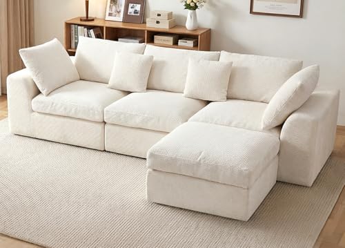
Calming color palettes lean on soft blues, muted greens, and warm beiges. These hues lower visual tension and help your brain relax.
Pick paint colors like pale blue-gray, sage green, or a warm sand to set a quiet base in living rooms and bedrooms.
Use matte or low-sheen finishes to avoid glare. Test big swatches on your walls at different times of day—sunlight can totally shift the tone.
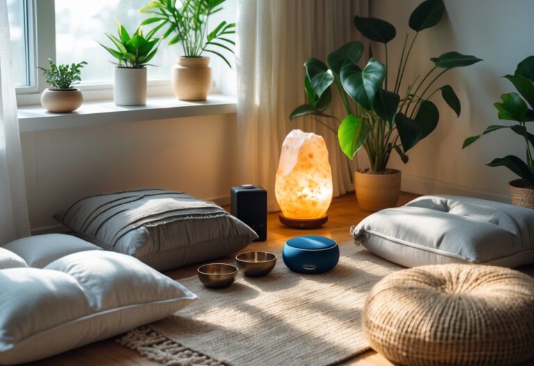
Match textiles and rugs to the same family of hues to keep the space cohesive. Layer color with natural materials: wooden floors, linen curtains, and stone accents deepen the calming effect.
Keep patterns minimal and subtle so colors remain the focus. Too many patterns can get distracting fast.


The Role of Neutral Tones in Zen Home Design
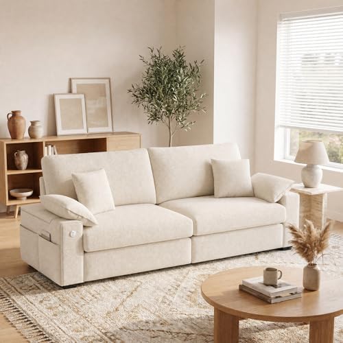
Neutral tones form the backbone of many zen color palettes. Soft whites, greiges, and taupes create a restful backdrop you can live with for years.
Use a dominant neutral on walls and larger furniture to keep visual clutter low. Add depth by varying neutral shades between floors, trim, and upholstery.
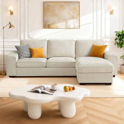
For example, pair a warm ivory wall with a slightly darker beige sofa and a pale gray rug. This creates contrast without harshness.
Neutrals also make it easy to introduce natural hues and complementary shades. They let accent colors stand out calmly, and honestly, they just work so well with wood, metal, and plant life.


Selecting Accent Colours for Mindful Decor
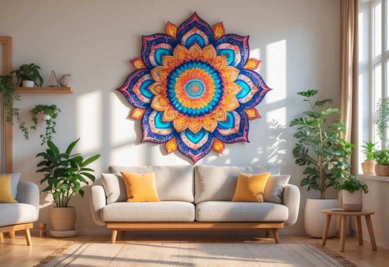
Pick one or two accent colors inspired by nature—think moss green, muted terracotta, or soft ocean blue. Use them in cushions, art, or maybe a single painted feature wall to keep things intentional.
Balance saturation: go for desaturated, earthy versions of a color instead of bright tones. This keeps the vibe soothing but gives the room personality.
Repeat each accent in three places to create rhythm—like a throw, a vase, and a piece of artwork. Consider complementary shades for harmony.
If you pick sage green accents, try adding small touches of warm wood or pale beige to tie it all together. Keep accessories minimal so the accents feel mindful, not distracting.


Colour Psychology and Practical Interior Choices

Choose colours that calm your mind, match your light levels, and work with your furniture and plants. Focus on soft blues, sage greens, warm beiges, and soft grays paired with natural light and simple textures.
Understanding Colour Psychology for Calm Spaces
You respond to colour with mood and focus changes. Soft blues—like sky blue or pale blue—slow your heart rate and lower stress, making them good for bedrooms and reading nooks.
Sage green ties to nature and helps your mind settle; use it where you want steady calm, such as a home office or dining area. Soft neutrals—warm beige, taupe, and soft whites—give a gentle backdrop that keeps the room feeling open without visual noise.
Soft grays can feel modern yet soothing when they have warm undertones. Match tones to your natural light: cool greys and blues work best in south-facing rooms, while warm neutrals suit north-facing spaces.
Optimizing Calming Colours in Living Spaces
Pick one main soothing colour and two supporting tones to keep spaces calm and layered. For example: powder blue walls, warm beige sofa, and sage-green cushions.


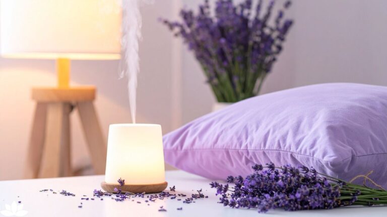
Use soft lighting—table lamps and dimmers—to enhance the colour’s effect after sunset. Add natural elements like wooden floors, jute rugs, and houseplants to strengthen the zen palette.


Keep high-contrast accents minimal; a single darker throw pillow or a muted terracotta pot adds depth without breaking calm. Test paint samples on large poster boards and view them at sunrise and evening to see how natural light shifts the hue.
Conclusion: Creating a Zen-inspired home isn’t about following a strict set of rules—it’s about tuning in to what feels right for you. Don’t be afraid to experiment with shades, textures, and the occasional accent, but focus on what genuinely brings you a sense of peace. If your home feels like a breath of fresh air at the end of a long day, you’ve nailed it. Colour can quietly transform your space, and honestly, that’s a little bit magic.
Creating a Minimalist Colour Scheme for Relaxation
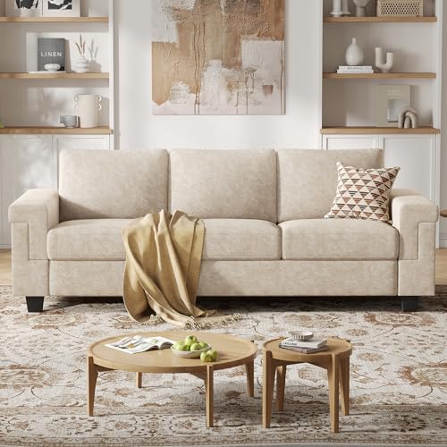
Try keeping your palette to just three or four colours: a base neutral, a calming mid-tone, a soft accent, and maybe a trim shade if you’re feeling fancy. For instance, think soft whites as your base, a gentle gray mid-tone, a hint of sage green for an accent, and a warm beige on the trim.
This approach keeps things looking put-together—and honestly, it just makes life easier when you want to tidy up or swap things out.
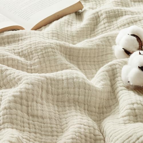
Instead of relying on bold colour, bring in texture for that extra something. Linen curtains, matte paint, and woven baskets add a bit of warmth without making the space feel chaotic.
Stick to soft neutrals for big surfaces. Save those calming or pale blues for smaller spots, like an accent wall or maybe your bedding.
That way, everything feels peaceful but not boring—just the right kind of minimalist calm.
Honestly, a thoughtful colour scheme makes a world of difference. When you walk in, you’ll feel it: calm, collected, and ready to relax. Isn’t that what home’s supposed to be?