Painting your room blue might actually help calm anxiety. Blue tones are known for their soothing effect on both mind and body.
It’s kind of like bringing the calmness of the sky or water indoors—something about those hues just feels relaxing, right?
Using blue paint in your space can create a peaceful atmosphere that helps reduce stress and promotes a sense of calm.
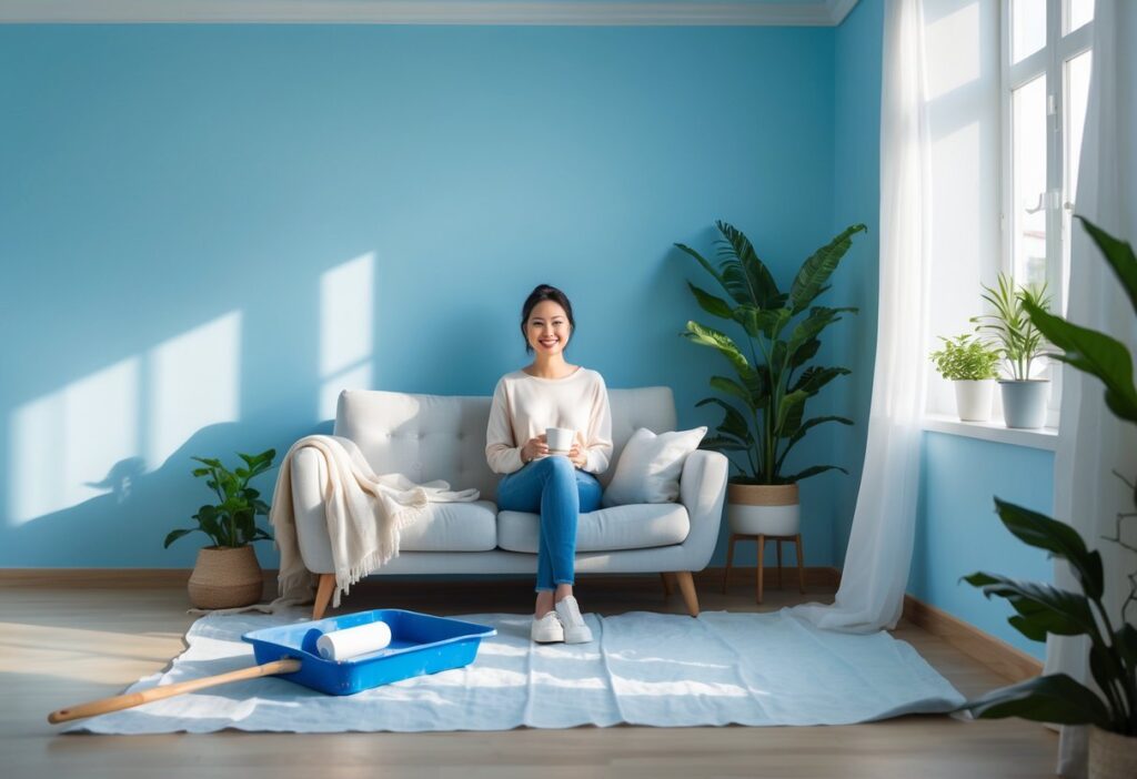
But not all blues are created equal. Lighter or softer blues usually do the trick if you want that calming vibe.
Those gentle shades can make your room feel airy and inviting, which is honestly a nice way to unwind after a long day.
You don’t have to rely solely on traditional methods like therapy or medication. Sometimes, just tweaking your surroundings with color can be a surprisingly supportive way to help manage anxiety.
Color therapy, also called chromotherapy, taps into colors like blue and green to promote emotional well-being. When you paint your space with these shades, you’re basically inviting their natural ability to soothe your mind.
This approach is catching on as people look for easy ways to boost their mental health at home. It’s simple, but hey, sometimes simple works.
Understanding the Impact of Blue: Can Painting Your Room Soothe Anxiety?
Blue is often linked to calmness, and painting your room blue may help lower anxiety by affecting both your mind and body. It’s fascinating how color can interact with your nervous system and even influence the way your brain processes things.
Using the right shade of blue in your living space can promote mental health and create a peaceful environment. But how exactly does this work?
The Science of Color and the Nervous System
Colors influence your nervous system by affecting brain activity and hormone levels. For example, blue light can actually slow your heart rate and help reduce blood pressure.
These changes help lower stress hormones like cortisol, which tend to spike when you’re anxious. It’s not magic, but it’s definitely interesting science.
Your body’s natural clock—your circadian rhythm—also responds to blue light. Exposure to soft blue tones can help regulate sleep patterns, which is honestly a game changer for overall well-being.
Better sleep means you’re more resilient against anxiety. It’s all connected, isn’t it?
This link between color and the nervous system is probably why blue tones help you feel a bit more balanced in daily life.
Blue Tones and Mental Health Benefits
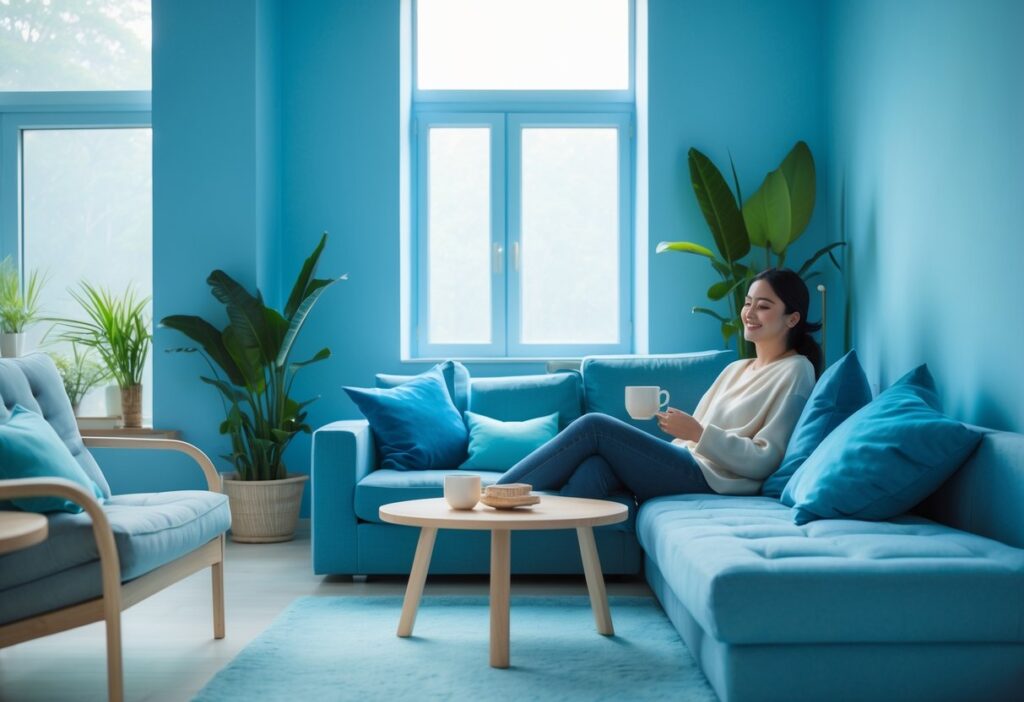
Blue is associated with relaxation and mental clarity. Some studies suggest that blue hues can reduce feelings of worry and tension.
This calming effect makes blue a favorite for spaces meant for rest or focus—think bedrooms, reading nooks, or even home offices.
But not all blues work the same way. Soft or muted blues tend to soothe, while bright or intense blues might actually feel a bit too stimulating for some folks.
So, choosing the right shade is key if you want to ease anxiety. It’s a small detail, but it matters.
By incorporating blue into your room’s paint, you might just create a setting that supports emotional balance and reduces mental stress. Worth a try, right?
Color Psychology of Blue in Home Environments
The way you use blue in your home absolutely affects your mood. Blue reminds us of the sky and ocean—those big, peaceful spaces that just feel safe.
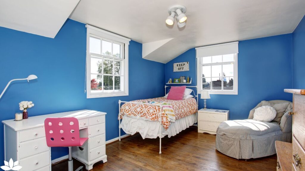
In interior design, blue walls show up a lot in bedrooms, living rooms, and meditation areas. These are spots where a calm atmosphere really makes a difference.
Pairing blue with other soft colors can actually boost its calming effect. But if you mix it with harsh, bright colors, you might end up with a space that feels more tense than tranquil.
This kind of mindful use of color can really support your overall well-being. It’s not a cure-all, but it’s a step in the right direction.
Color Therapy in Practice: Using Shades and Expert Guidance for Well-Being
Color therapy can influence your mood and energy through shades chosen with care. If you’re not sure where to start, color therapists can help guide you in picking colors for mental calmness and emotional balance.
Different colors affect your body’s energy centers—sometimes called chakras—which can impact your overall well-being. It’s a bit holistic, but lots of people swear by it.
Principles and History of Chromotherapy
Chromotherapy, or color therapy, is based on the idea that colors have unique wavelengths and energies. This isn’t just a new trend; it actually dates back thousands of years to places like ancient Egypt, India, and China.
These cultures used light and color to treat illnesses and improve health. It’s pretty wild to think we’re still using some of those ideas today.
You can think of each color as carrying a vibration that interacts with your body. The goal is to balance your energy centers through exposure to these colors, helping with both physical and mental states.
For instance, blue is thought to soothe, while red might boost energy. It’s not a one-size-fits-all deal.
How Color Therapists Recommend Relaxing Hues
Color therapists choose shades carefully, based on how each affects your mood and body. Blue is a top pick for calming anxiety because it tends to lower stress and promote a serene feeling.
Cool, soft shades of blue—like sky blue or pastel blue—often work best. Experts usually suggest avoiding bright or intense tones, since those could be more stimulating than calming.
You could also use blue light in rooms where you want to relax, such as bedrooms or meditation spaces. It’s about creating an environment that feels right for you.
A color therapist will typically advise combining color with light exposure. Spending time in naturally lit rooms painted with calming shades can maximize the benefits.
So, does painting your room blue really help calm anxiety? Maybe not for everyone, but there’s enough evidence and personal experience to say it’s worth a shot. Even if it just makes your space feel a little more peaceful, that’s already a win in my book.
Other Calming Colors and Their Effects Beyond Blue
Blue gets a lot of attention, but honestly, it’s not the only color out there that can help you chill out. There are a few others worth considering if you’re after a more relaxed vibe.
- Green: Tied closely to the outdoors, green can sometimes ease stress and offer a sense of balance. It’s kind of like bringing a bit of the forest inside.
- Lavender: This gentle purple shade is frequently mentioned for its ability to soothe tension. Some folks even say it helps with sleep, though your mileage may vary.
- Soft pink: Muted pinks might sound unexpected, but they can actually reduce feelings of anger and add a touch of warmth. It’s subtle, but noticeable if you pay attention.
- Light gray: A neutral gray doesn’t really shout for attention. Instead, it provides a peaceful background that doesn’t mess with your emotions too much.
You can mix these colors with blue or swap them in entirely, depending on what feels right for you. If you’re not sure where to start, a color therapist could point you in the right direction—sometimes it’s hard to figure out what actually works until you try it.
In the end, there’s no single answer when it comes to calming colors. Trust your instincts, experiment a little, and you’ll likely find a combination that makes your space feel just right.